Project: Amortize
If you would like to see the project, check it out here: Amortize - Project Page. Links to a deployed demo and the GitHub repo are available. Otherwise, keep reading for more info on how I built it!
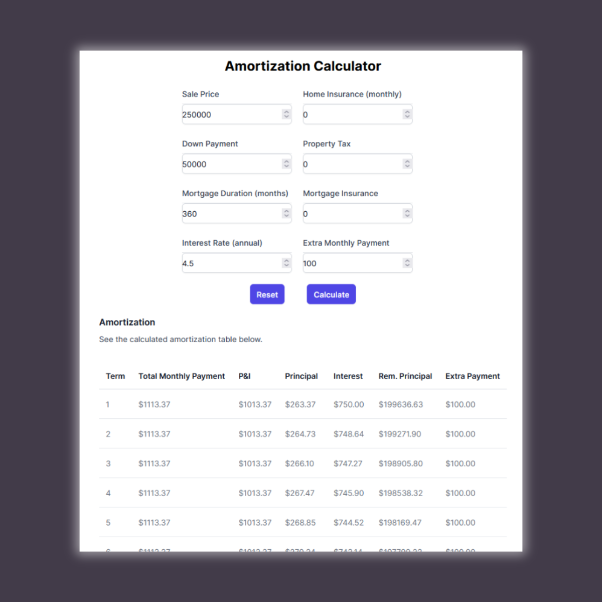
While shopping for a house, the budget is one of the biggest deciding factors. So, I was looking for an amortization calculator that could help me budget the typical pieces of a mortgage: P&I, taxes, insurance, but also calculate extra payments. Surprisingly, I couldn’t find one that did everything I needed.
So I made my own.
This project came from me really just needing a more specific calculator than many of the pre-built options I could find online. At first, it was simple enough and served my needs with no frills. The whole “app” could be client-side with no need for any type of server or data storage. I wrote the interest and amortization schedule formulas in JavaScript, and displayed results in a table.
Great! Job done ✅
But then I wanted to include it as part of my portfolio here, so I thought adding a little bit of polish was called for.
All in all, this is a client-side web application built with: React/Next.js, Tailwind CSS, Vercel, and GitHub Actions.
Writing the formulas
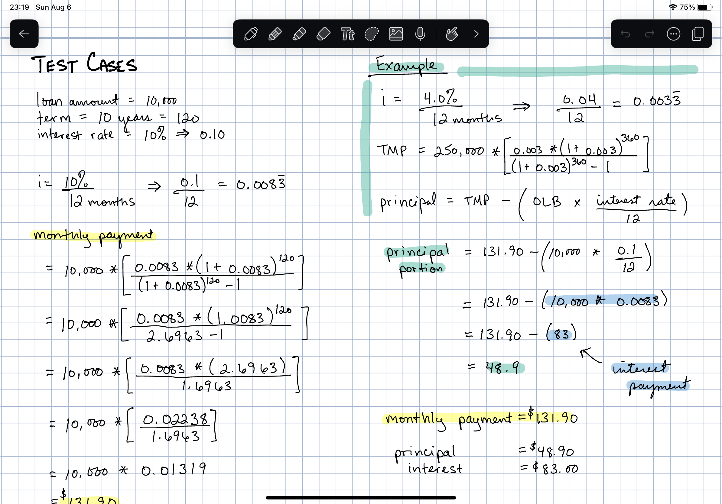
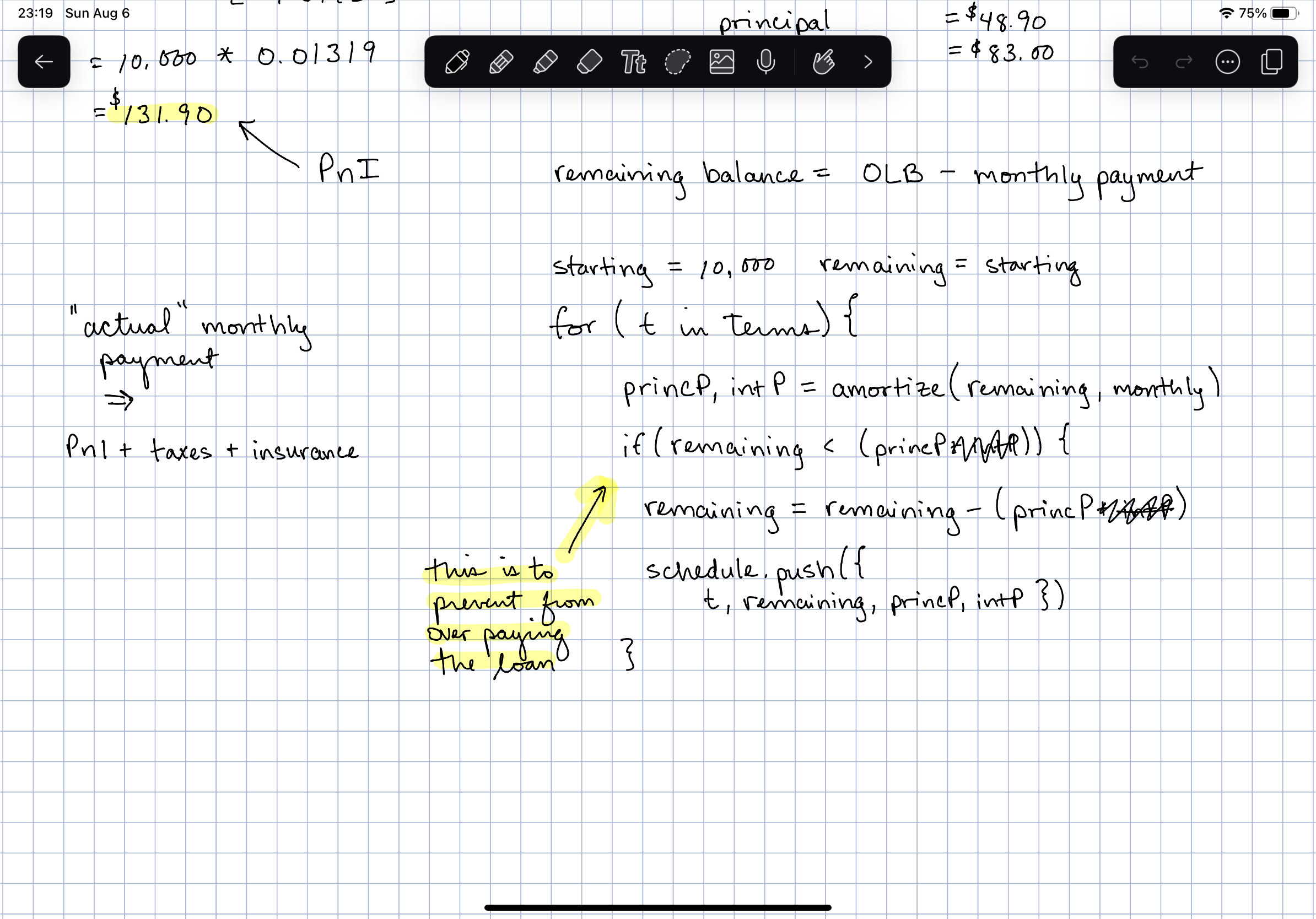
Before any code, I needed a refresher on the math behind an amortization schedule. Quick Google search, a quick article from Investopedia, and we were off to some pseudo-code. I used to do this sort of thing with pencil and paper. Lately, I’ve switched to doing these quick notes/mockups on iPad with Notability. Admittedly, much more expensive but ehh…we get nicer screenshots like this.
UI improvements & responsive design
This problem always seems to bite me—I get excited about an idea, build it, and then find out it looks broken on the screen most people will browse to it from. Okay, so some changes are in order.
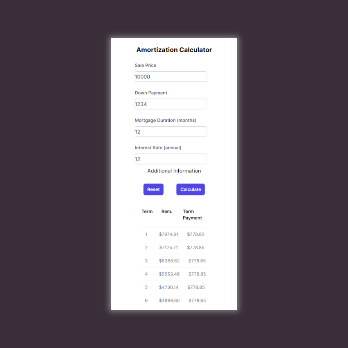
I primarily designed this calculator to be used from a desktop view. All of my budgeting is done there, so that type of view makes the most sense for me. However, I want this to still translate well for anyone who may come across it, so I started cramming it to a smaller view. Tabular data is a classical challenge for responsive design though. There are many strategies, but they all fallback to conditionally hiding data (likely) behind some user interaction. The two key changes on mobile: (a) half of the form is hidden behind “Additional Information”, and (b) the table is reduced to three columns, and clicking/tapping the row shows full details for the term.
Fun note!—to get that “dropdown” interaction on each row, the mobile view is no longer a table—I rebuilt it as “<ul>”.
Tailwind allowed me to have quick turnaround on these changes. Some people may comment about the “inline styles-esque” look once Tailwind is applied to code (I get it), but I like that I can glance at some JSX and the applied styling is perceptible. Additionally, I’m using Tailwind UI and Headless UI. I don’t have the time (nor UI/UX design experience) to design my own component library. Tailwind UI isn’t free like some other component libraries, but I purchased for a previous freelancing project and the license allows me to use it pretty liberally.
This little gist below made the majority of this UI change straightforward. Specify an ‘xs’ screen size in the “tailwind.config.js”, and I was off with smartphone-approved styles.
CI/CD: GitHub Actions & Vercel
We really are spoiled by the tools Vercel is putting out. Every time I build another Next.js project I feel like I’m cheating by having it automatically setup deployments. This type of integration just makes these projects that much easier.

That deployment and dependencies audit check! ✅ the tests though… 🙃
This is the “audit” workflow seen in the PR comment screenshot above. Also, I added a GitHub Actions workflow that runs “sandworm-audit” on every pull request. I would like to report findings to a PR comment (which this doesn’t do), but this is okay for now. More on this in just a bit.
A bit of AppSec flavor
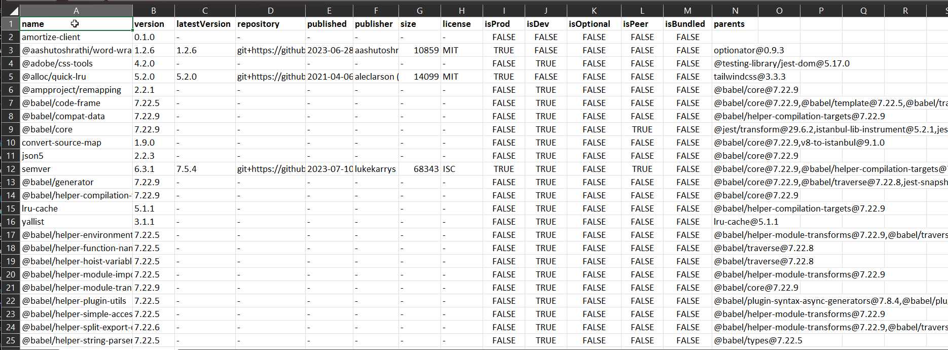
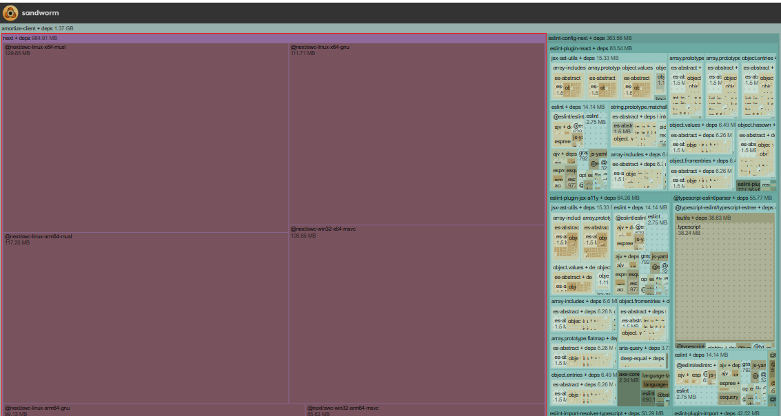
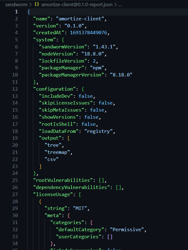
It feels kind of weird building a client-side project for a portfolio without any part of it being applicable to AppSec. Considering this project’s design being so simple allows it to avoid many common security pitfalls, I thought it was a good opportunity to focus on the third-party dependencies (SCA) in the node_modules directory.
Sandworm is a JavaScript dependency auditing tool built for exactly that. I’m only using their free, open-source offering (as this project isn’t really in production), but they do have a paid option with more features to check out. Having used more enterprise-friendly tools like Sonatype and Snyk in my professional roles, it’s awesome to have this type of tooling available for free. Heck, even just having a better understanding what happens after “npm install …” finishes executing is worth it.
References
Amortization, Investopedia: https://www.investopedia.com/terms/a/amortization.asp
Notability: https://notability.com
Tailwind UI: https://tailwindui.com/
Headless UI: https://headlessui.com/
Vercel: https://vercel.com
Sandworm: https://sandworm.dev/
Image credits
- “money house”, Kostiantyn Li
- “budget”, Pixabay via Unsplash